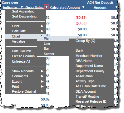
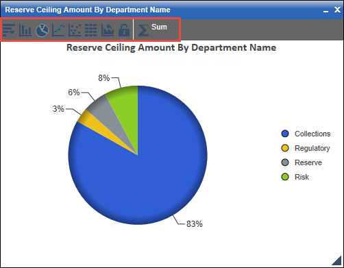
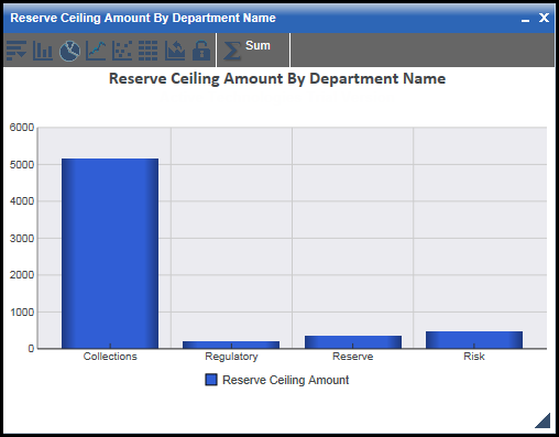
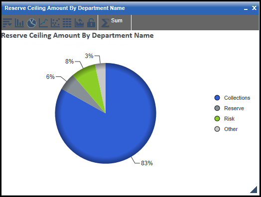
A box opens displaying your chart. Here is an example of a pie chart:
The chart toolbar, located as in the image below, enables you to perform various functions.
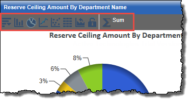
The toolbar provides these icons:

 (data menu)
Opens a menu providing these options:
- New: Click this to create a new instance of your chart that you can edit while leaving the original untouched.
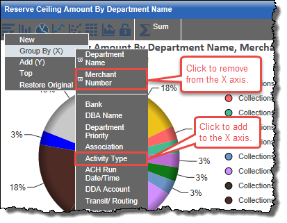
- Group By (X): Select this to open a sub-menu where you can select other data groupings to add to your X axis or remove them.
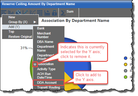
- Add (Y): Select this to open a sub-menu where you can select other data groupings to add to your Y axis or remove them.
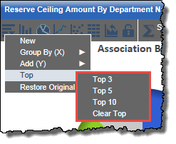
- Top: Select this to open a sub-menu where you can click an option to display just the top 3, 5, or 10 records in the chart, or clear a previous top selection.
- Restore Original: Click this to restore the original chart, removing any edits you made.
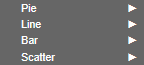
 Bar
Bar
Click this to render the chart as a bar chart.
 Pie
Pie
Click this to render the chart as a pie chart.
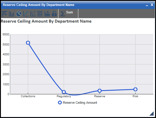
 Line
Line
Click this to render the chart as a line chart.
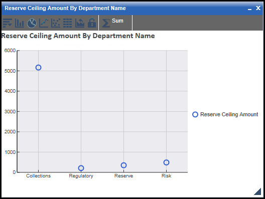
 Scatter
Click this to render the chart as a scatter chart.
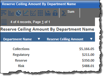
 Rollup
Click this to render the chart as rollup information.
 Original Chart
Click this to restore the original chart, removing any edits you made.
 (lock)
Click this to set the current chart as the original chart, which you can then return to later after making edits by clicking the Original Chart icon .
 (recalculate Y axis)
Opens a menu allowing you to select one of these options to refresh the chart with a recalculated Y axis:
- Sum: Refreshes the chart to display the Y axis as sum values (this is the default).
- Avg: Refreshes the chart to display the Y axis as average values.
- Min: Refreshes the chart to display the Y axis as minimum values.
- Max: Refreshes the chart to display the Y axis as maximum values.
- Count: Refreshes the chart to display the Y axis as count values.
- Distinct: Refreshes the chart to display the Y axis as distinct values. A distinct value is one that is unique or is the first occurrence of a duplicate value.